
What Is Texture in Art
Texture is the part of a painting that light can catch. Color tells you the climate of the wall. Drawing tells you where to look. Texture tells you that the surface occupies space: a ridge throws a shadow at four in the afternoon and almost disappears at noon. When people shop for Textured Wall Art, that is what they are trying to buy—handmade relief on canvas, not a photograph of roughness.
Art schools split the idea in two. Wikipedia’s page on texture in the visual arts calls the first kind actual, physical, or tactile texture: variation you could feel if you were allowed to touch the object—canvas weave, sand, raised paint, cracked ground, metal, glass. The second kind is visual or implied texture: the illusion of that surface, drawn or printed so it looks rough while remaining flat. A river stone in a photograph has visual texture. The same stone in your hand has actual texture. A living-room canvas should be honest about which one it is.
Tate’s glossary on impasto is the museum name for actual texture in paint. Impasto is an area of thick paint. Venetian painters used it; Rubens used it; nineteenth-century landscape painters used it. In modern painting it became a principle: the surface should have its own reality, not only act as a window onto another scene. The brushmark is a kind of handwriting. Mid-century painters such as Frank Auerbach pushed the paste toward relief. You do not need that extreme on a sofa wall. You do need the same honesty: if the listing says textured, the paint should stand up.
Abstract art, in Tate’s definition, does not copy visual reality; it works through shape, color, form, and gesture. Texture is often the gesture you can still see after the subject has gone. A white field of knife marks is already a painting. A blue-beige “sea” that never quite becomes a coastline is doing the same job with a hint of weather. Canvashi’s textured collection lives in that range: orange-yellow-black landscapes, teal-green-beige fields, white relief, pink-blue-gold, blue-gold-gray—hand-painted to order, built paste, not printed grain.
Actual texture versus visual texture
Use light as the test.
If a lamp at the side of the room would draw a moving line along a ridge, the texture is actual. If the roughness looks identical from every angle because it is only a pattern in a flat film, the texture is visual.
Van Gogh remains the public example. In The Starry Night the sky is not a smooth blend. The paint is laid in ropes. A close photograph of those ridges is still only a picture of texture. Standing in front of the canvas is different: the surface occupies air.
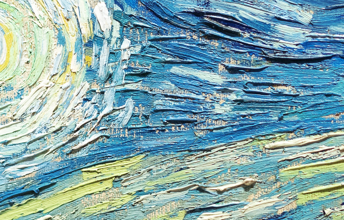
A print of that sky on a sofa wall is visual texture. A handmade field of similar ridges—without the village—is closer to what textured wall art claims to be.
Photography, drawing, and graphic design use visual texture all the time. That is not a lesser art. It is a different object. The confusion starts when a shop photograph of impasto is sold as the impasto.
How painters build texture
Several methods appear in contemporary handmade canvas. They are not interchangeable.
Impasto and the palette knife. Paint is left thick. A knife lays a plane, a ridge, or a dragged edge. The mark has direction. This is the closest domestic cousin to Tate’s painterly surface.
Modeling paste and plaster-like grounds. A neutral body is built first, then stained or painted. Peaks can stand higher than oil alone will hold. Deep paste is why some works should be stretched with care and hung where shoulders will not brush them.
Dry brush and scrape. A nearly dry brush catches only the high points of an earlier layer. A scraper opens the color underneath. The relief stays lower than plaster, but it still changes with daylight.
Layered glazes over a built skin. Color sits in the valleys. The ridges stay lighter. Side light separates the two.
Metallic leaf on relief. Gold or silver on a raised edge catches light like a worn tool. On a flat print it is only a yellow shape.
Canvashi’s textured listings use this vocabulary in different climates: a white field for a quiet room, seaside blues and beiges, teal-green earth, a warmer orange-yellow-black landscape. The names describe hue. The thing to inspect is height.
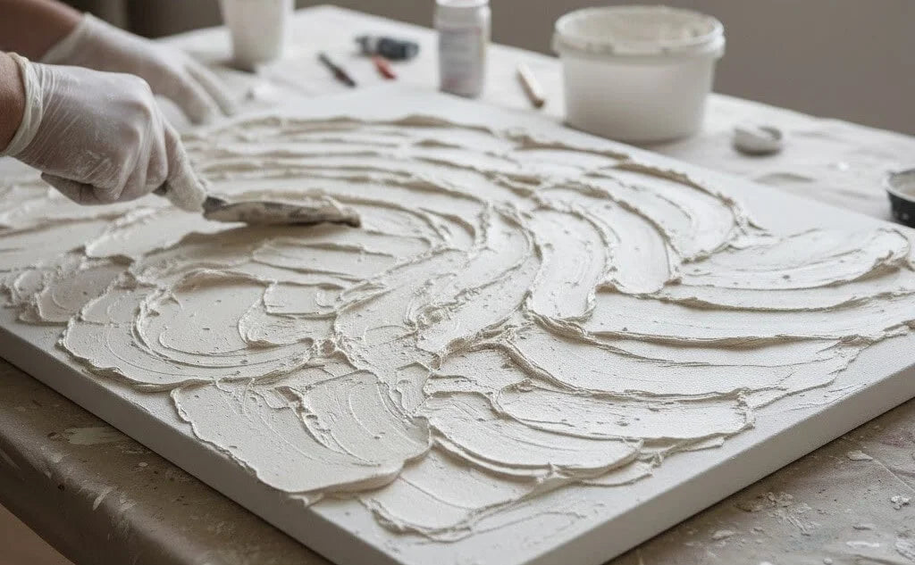
A knife in wet paste is the difference between a surface and a picture of a surface. Head-on product photos flatten that difference; an angled studio shot does not.
Why texture matters more at extra-large scale
At eighteen inches, a few ridges are a detail. At fifty or sixty inches they become architecture. Light walks across the field the way it walks across plaster. That is why textured wall art and large canvas belong together. A small souvenir on a long wall reads as a sample. A large flat print of “texture” reads as wallpaper.
Scale still follows furniture. Above a sofa, two-thirds to three-quarters of the sofa width is the usual span. Relief adds visual weight, so a mid-value, high-relief canvas can hold a wall that would swallow a pale, smooth painting of the same inches. Leave about 6 to 12 inches above the sofa back. Do not raise the work toward the ceiling to fill a tall room; the shadows need to meet people at living height.
Pale rooms can take clearer peaks. Bedrooms and offices usually want lower relief and mid values so a downlight does not glitter. Oak and linen sit with sand and warm white. Gray sofas sit with plaster and ash. Teal, gold, and orange need a simple textile field or they compete.
Light is part of the medium
Texture without raking light is half switched off. A window to the side of the painting, or a picture light set off-axis, will show the work. Cans aimed straight at glossy peaks will glaze them. If the room has only harsh overhead lighting, choose a quieter, less glossy relief—or add a lamp.
This is also why photographs lie. A head-on shot erases ridges. Ask for an angle. Tape the intended rectangle on the wall and look at noon and after dark.
Texture in abstract painting versus depiction
A depicted tree can have painted bark that is still flat. An abstract field can have no tree and still be more “real” as an object because the paste stands up. That is why so much textured wall art is abstract. The subject is the handling.
You can keep a hint—sea, land, weather—without illustrating it. The Canvashi seaside and landscape titles work when the ridges do the weather and the color stays limited. They fail when the image needs a caption to be a coastline.
How to choose textured wall art
- Decide how much shadow you want: clear peaks, moderate knife work, or a low scraped field.
- Match temperature to the room.
- Size to the sofa or the clear wall.
- Confirm the texture is built.
- Plan the light before the frame. Deep work often looks better on a deep stretcher, unframed.
- Keep the canvas out of shoulders, door swings, and hard sun.
Texture in art is not a finish you add at the end. It is one of the oldest elements of painting, as basic as line and color. On a contemporary wall it is the element that keeps a large canvas from behaving like a screen.
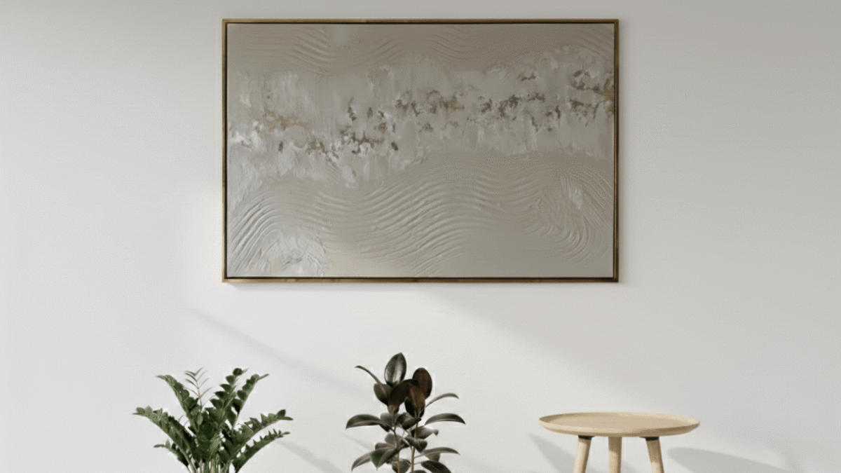
Once the work is on the wall, the test is simple: walk past it at two times of day. If the surface changes, you bought texture. If it does not, you bought a picture of texture.
What is texture in art?
It is the surface quality of a work—how rough, smooth, raised, or woven it is. In painting that can be actual (thick paint, plaster) or visual (the illusion of roughness on a flat plane).
What is the difference between actual texture and visual texture?
Actual texture has physical height and casts small shadows. Visual texture only looks tactile. Wikipedia’s texture entry is built on that split.
Is impasto the same as texture?
Impasto is a method: leaving paint thick. Texture is the broader element and can also include plaster, sand, fabric, or collage.
How should I light textured wall art?
Use raking light from a window or an off-axis picture light. Avoid shiny downlights aimed at the peaks.
How large should textured wall art be above a sofa?
About two-thirds to three-quarters of the sofa width. Relief already adds weight, so you do not always need the widest possible span.
Can I tell texture from a product photo?
Only if the photo is angled. A straight-on shot flattens ridges. Ask for a side view before you treat the piece as three-dimensional.
Does textured art have to be abstract?
No, but abstraction makes the surface the subject. A landscape can still be textured if the paint stands up rather than describing bark with a flat stroke.