How to Choose Beach Artwork That Keeps the Climate, Not the Souvenir
Beach artwork fails when it tries to be a holiday. Umbrellas, lettered piers, and a cartoon horizon date a room the year the towels change. What holds is climate: sand against water, glare against a cooler ground, a broken white that reads as foam only from close in. If you need the wall to feel coastal without hanging a postcard, start there.
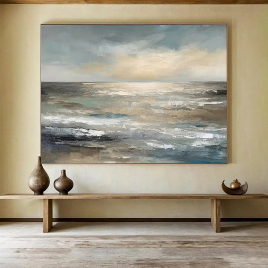
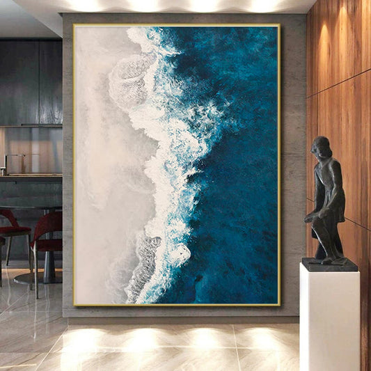
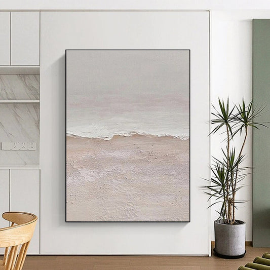
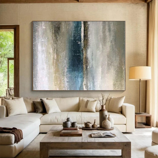
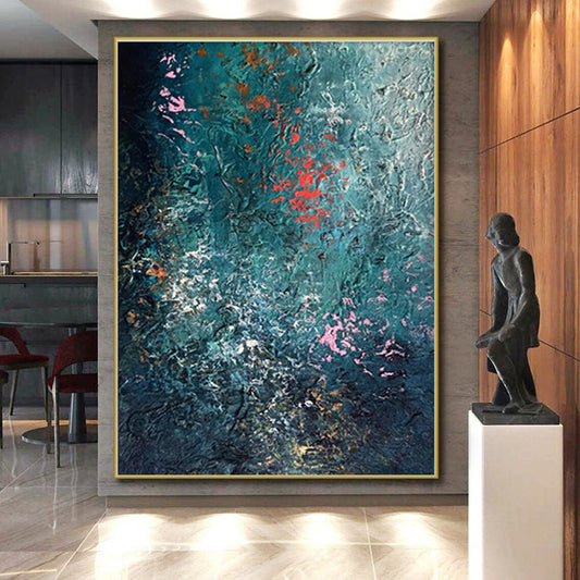
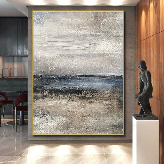
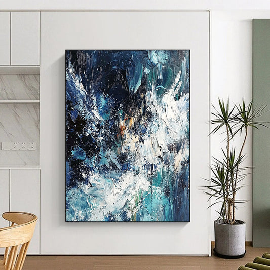
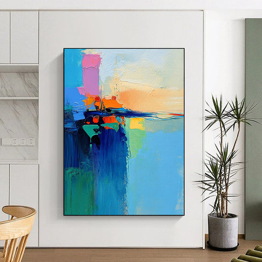
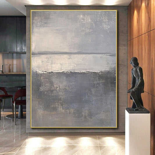
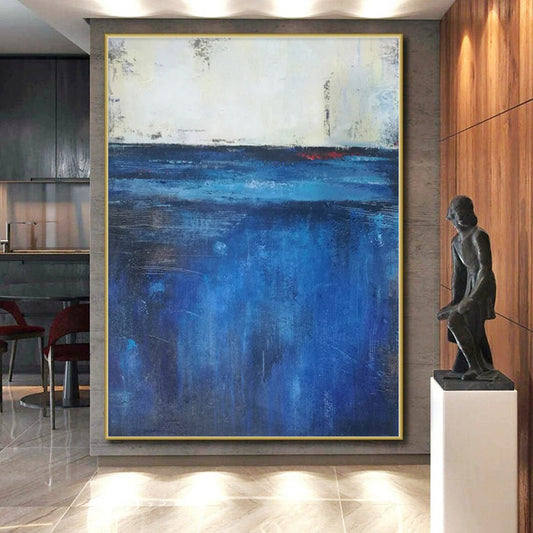
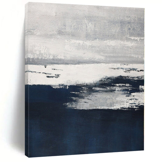
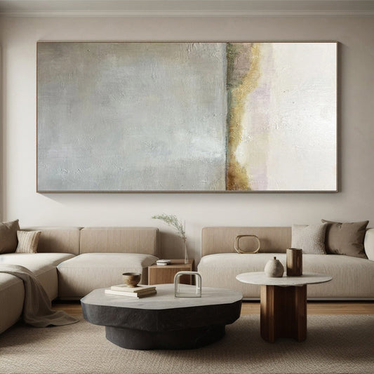
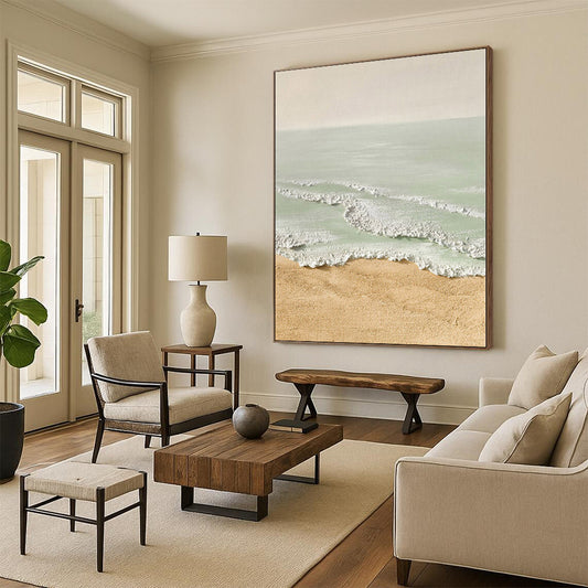
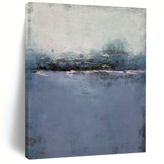
Beach Artwork in this shop is hand-painted canvas in that middle register—blue-beige shores, gray sand, textured tide—not a printed boardwalk. The listing is a language of weather. The piece you receive is painted to order in that language.
Shore painting is older than the beach house
Wikipedia’s article on marine art draws a useful line. Marine work takes its subject from the sea. Maritime work usually includes ships and human traffic. Beach scenes sit in the same family, but they can skip the vessel. For a contemporary interior that already has furniture and screens, the empty shore is the stronger brief: water, sand, and light. A named bay and a row of cabanas are extra.
Painters who stayed with the sea learned that the subject is not a catalog of objects. Tate holds J.M.W. Turner’s late Seascape as weather first—tone, movement, a horizon that is almost a temperature. You are not buying a Turner. You are borrowing the habit: let water and sky do the talking.
The National Gallery’s note on Turner’s Dutch Boats in a Gale is the other half of the lesson. Even when boats are present, the picture is built from weather pressing on mass. Scale and value do the work. A small, busy beach print over a long wall has neither.
How to match beach art to a room that may not face the ocean
An inland apartment does not become fake because the canvas is coastal. It becomes fake when the canvas is a brochure. Keep boats, surfboards, and town names out of the frame if the rest of the house is abstract. Keep umbrellas out if you will still live with the painting in February.
Choose temperature before you choose “blue.” Oak and walnut sit with gray-green water, sand, and muted teal—not electric turquoise. Gray sofas need gray in the water so the wall does not turn neon. White rooms need a mid-to-deep shore so the canvas does not vanish. A west window already supplies sunset; a quieter, more abstract dusk field is often easier than another blaze of cadmium.
Light on water is unforgiving. North light cools teal toward gray. Warm bulbs pull aqua toward green. A spotlight on broken white foam turns every ridge into glare. Bedrooms and offices on camera usually need mid values and lower gloss. Living rooms can take a stronger split between sand and sea if the seating wall is otherwise empty.
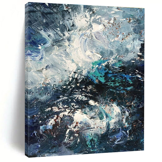
Texture helps when the climate is quiet. Knife-cut swell and scumbled foam shift as you walk past. A printed photograph of a beach stays poster-flat. If the listing shows raised surface, ask whether that relief can ship rolled or must travel stretched.
Format follows the empty rectangle. A horizon wants width. A tall unused strip beside a window can take a vertical swell. Square formats suit hallways you pass close. A 24-inch seascape on a 90-inch sofa wall looks like a postcard no matter how good the blue is.
Handmade shore versus a coastal print
Phone photos flatten water into one fill. Hand-painted beach work should break: darker troughs, scraped sand, a white that is not the same from every step. Look for angled close shots, oil or acrylic on canvas, and a note that the piece is painted to order. Treat the thumbnail as climate, not as a location you could find on a map.
Ask for a greyer sea if the floor is oak. Ask for less foam if the room is already bright. Approve photos of the finished surface before anything ships. Custom stretch exists for the wall you measured—not for a size that looked fine in a grid.
A short buying order
- Decide how much place you need: open water, a sand bar, or only the temperature of the shore.
- Match that temperature to wood, stone, and daylight.
- Measure the empty span; pick horizontal unless the unused space is height.
- Check sheen against lamps and any camera angle.
- Confirm rolled versus stretched if the surface is built.
- Review photos of the finished canvas before it ships.
Beach artwork that still works in an inland room is weather on canvas. The souvenir is what fails.
What counts as beach artwork?
Canvas whose main climate is shore—sand, shallows, horizon, glare—not a portrait that happens to include water. It can be nearly abstract. It should not need a town name to finish the wall.
Will beach art look fake in an apartment far from the coast?
Not if the water is quiet and the props stay out. Postcard beaches with umbrellas are what feel borrowed. A gray-beige field with a soft split between sand and sea can sit anywhere.
What blues sit with oak floors?
Gray-green, sand, and muted teal. Bright turquoise often fights the wood. Ask for a greyer mix if the listing runs too clean.
Is a wide canvas better than a square over a sofa?
Usually. A horizon wants width. Use a tall canvas when the unused space is ceiling, not seating.
How is hand-painted beach art different from a print?
Handmade layers shift as you walk: foam breaks, sand scrapes. A print stays one photograph. Confirm oil or acrylic, and ask for an angled close-up.
Can I order calmer water or a custom width?
Yes. Send the wall measurement and a daytime photo. Keep the same horizon language as the listing, with less spray or a cooler sea if the room is already bright. Approve photos before shipping.