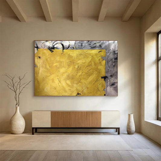
How to Choose a Yellow Abstract Painting for Real Rooms
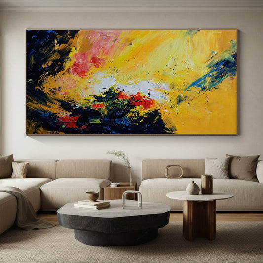
Yellow is the most visible color on a wall. Used with control, a Yellow Abstract Painting can warm a north-facing room, lift a kitchen, or give a gray living room a single point of light. Used without a plan, it can glare. This guide is for shoppers looking at hand-painted abstract canvas—especially oversized works where yellow sits with black, white, gray, blue, orange, or red rather than covering the whole surface.
What yellow does in abstract painting
Yellow has two modern histories that still shape how a canvas reads at home. One is heat and daylight: painters chased stable yellow pigments because they could stand for sun and metal. The other is the mid-century decision to let color itself be the subject. In color field painting, large planes of hue replace figures and stories. Mark Rothko’s No. 5/No. 22 (1950) in the collection of The Museum of Modern Art is a clear museum example: stacked bands of yellow, orange, and red that hover rather than depict. The buyer’s lesson is practical. Yellow changes the temperature of everything next to it. With black it sparks. With white it opens. With blue it cools. With orange and red it becomes heat.
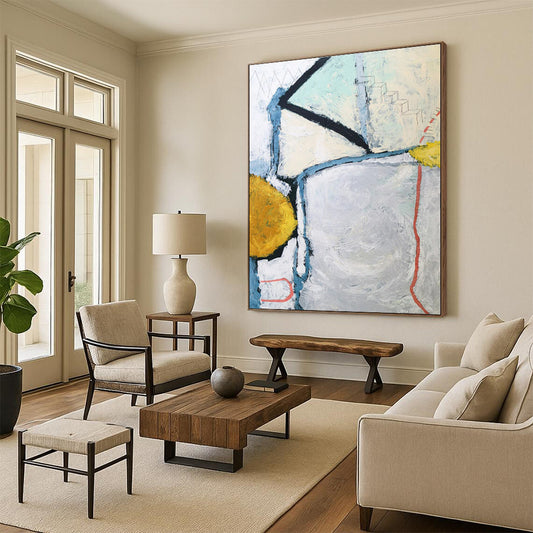
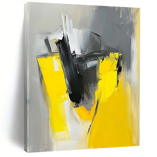
That is why most livable yellow abstracts are not monochrome fields. They are conversations: a yellow band against charcoal geometry, a lemon curve over white, a mustard vein through gray. Abstract expressionism left two habits that still work on residential walls—gesture (brush, scrape, texture) and field (broad color that holds a room). A hand-painted canvas can use both. A print of yellow usually offers only a flat version of the second.
Read the yellow before you buy the size
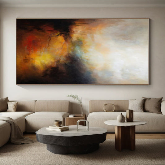
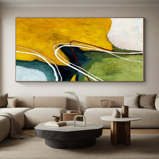
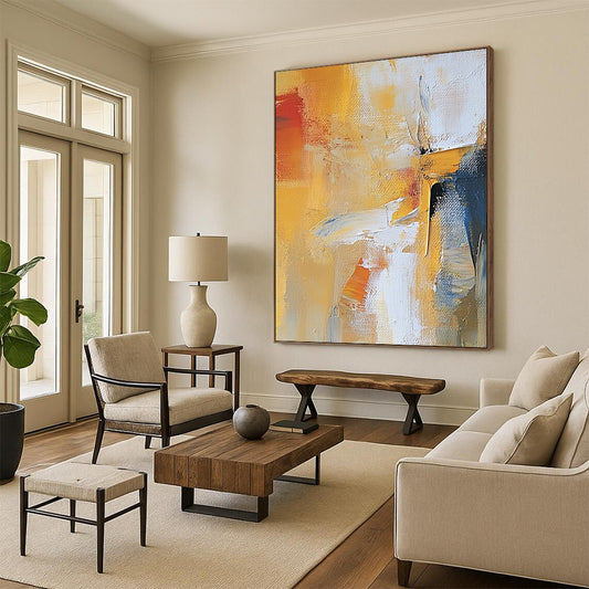
Not all yellows behave the same under household light. Lemon and chrome yellows feel sharp and contemporary; they suit kitchens, offices, and cool daylight, but can turn acidic next to warm oak. Golden and ochre yellows sit closer to brass and honey and settle into living rooms with walnut, linen, and cream walls. Mustard and yellow-orange lean toward autumn and hold up against black, rust, and deep green. Pale butter yellow is the quiet bedroom option; it needs texture or a dark counter-color so it does not vanish into a cream wall.
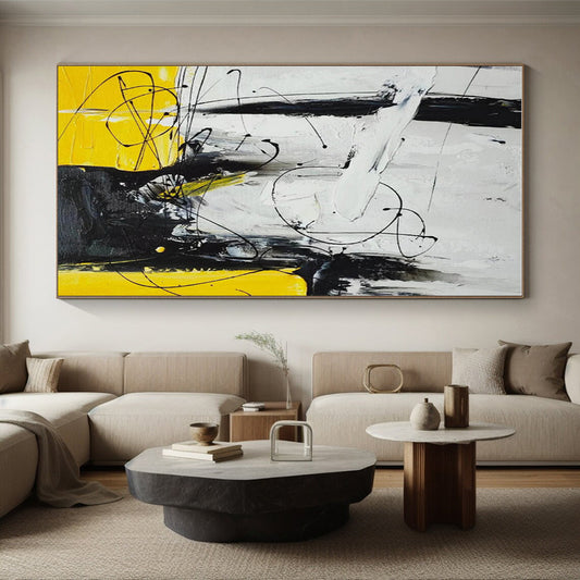
Ask one question of the product photo: is yellow the light source in the composition, or only a highlight? If it occupies more than about a third of the canvas, treat it as a room-temperature decision. If it is a stripe, a block, or a broken field inside gray or black, you can hang it in a quieter space without rebuilding the palette.
Color pairings that hold in a house
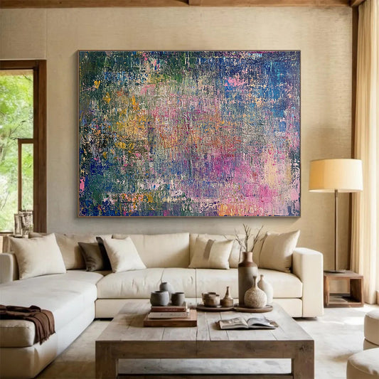
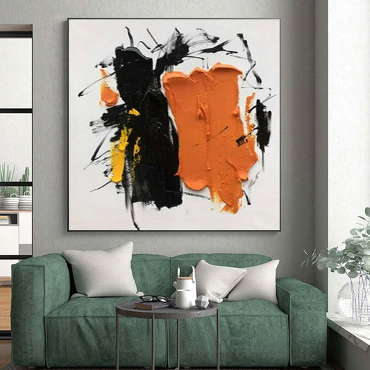
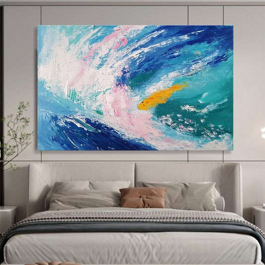
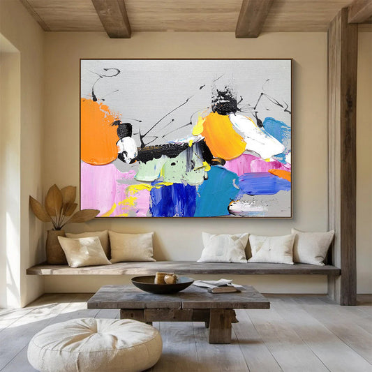
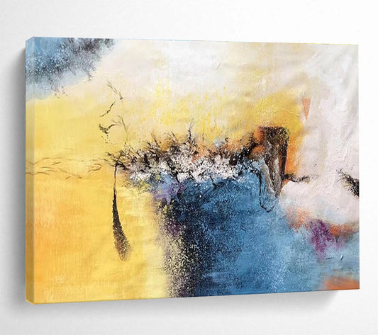
Black, white, and yellow is the highest-contrast set and suits modern sofas, stone, and graphic rooms. Gray, yellow, and white is softer above a light sofa or in a hallway. Yellow, blue, and white feels coastal or geometric and likes linen and oak more than heavy brass. Yellow with orange and red is energetic—better for a dining wall or sunroom than a bedroom you want dark at night. Multicolor canvases that add pink, green, or teal should echo a rug, a chair, or a tile already in the room.
Neutral walls help. Warm white, pale clay, charcoal, and sage let yellow register as color rather than noise. A wall already painted bright yellow rarely needs another yellow canvas.
Size, shape, and where yellow belongs
Above a sofa, bed, or console, aim for about 60–75 percent of the furniture width. A 90-inch sofa wants a canvas roughly 54–68 inches wide. Leave 6–8 inches between the furniture and the work. On an empty wall, keep the visual center near 57–60 inches from the floor.
Horizontal formats calm a living room and a bed wall. Geometric blocks suit offices and dining rooms. Curved yellows feel less architectural and work in kitchens and sunrooms. Oversized single canvases serve high ceilings better than a row of small bright prints. Yellow is often recommended for kitchens and offices because it reads as alert. That holds only if the hue is bounded. An oversized field of chrome yellow opposite a window can throw glare onto a screen or a table. Check the wall at the hour you actually use the room.
Surface, light, and a short checklist
A Yellow Abstract Painting earns its price in the surface. Texture paste, scraped grounds, and layered acrylic catch light; an inkjet yellow does not. Confirm the listing is hand-painted. Warm, dimmable light (about 2700–3000K) keeps golden yellows from turning brassy and lemon yellows from going neon. Gallery wrap with painted sides is the cleanest look. If you frame, use a slim float frame in oak, black, or white. Dust with a dry cloth. Keep the work out of damp and out of hard, all-day sun.
Measure the furniture, not only the wall. Decide whether yellow is the room’s heat source or an accent. Match lemon, gold, or mustard to the wood and lamps you already own. Then stop adding other bright objects to the same sightline. One clear yellow canvas will do more than three competing ones.
What rooms work best for a yellow abstract painting?
Kitchens, sunrooms, dining rooms, and offices take yellow easily if the hue is bounded by black, white, gray, or blue. Bedrooms work when the yellow is ochre or butter, not high-chroma lemon, and when the composition is not too busy.
How much of the canvas should be yellow?
If yellow is the dominant field, treat it as a lighting and wall-color decision. If it is a band or a cluster of marks inside neutrals, the painting will sit in more rooms without forcing new furniture.
What size yellow abstract should I hang above a sofa?
Use 60–75 percent of the sofa width and leave 6–8 inches above the back cushions. One oversized canvas usually looks more considered than several small yellow prints.
Is hand-painted yellow canvas better than a print?
For this color, yes, if you will see the work up close. Texture and layered paint keep yellow from looking like a flat graphic. A print can work at a distance; it rarely has the same edge and depth.
Will a yellow painting make a small room feel smaller?
A pale or broken yellow field on a light wall can open a room. A dense, high-chroma yellow with no surrounding wall can close it. Scale the canvas to the furniture and leave space around it.