Colorful Artwork: How to Choose a Vibrant Canvas Without Overwhelming the Room
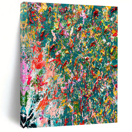
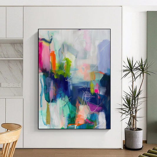
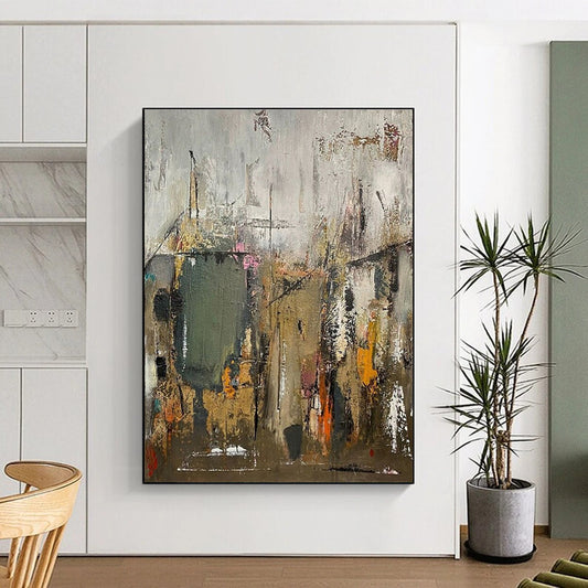
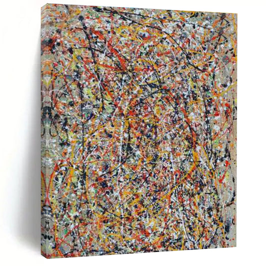
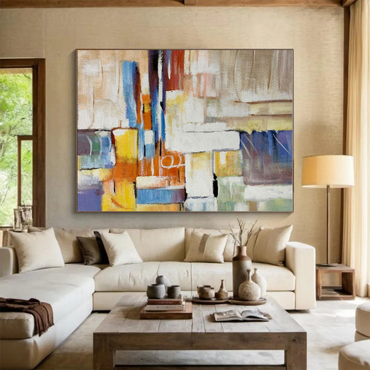
Colorful Artwork is easy to want and easy to get wrong. A high-key canvas can finish a pale living room in one decision, or it can fight the sofa, the rug, and the evening lamps. Canvashi’s colorful collection is hand-painted abstract work on canvas—splatter, geometric blocks, layered acrylic, floral and urban-inspired fields—sold in large and custom sizes. The buying order is still the room first: how much color the architecture can hold, then how the hues relate to each other, then scale and surface.
Color in painting is not only decoration. Tate’s definition of abstract art is useful here: the work does not copy visual reality; it uses shape, color, form, and gesture. On a colorful canvas, hue is the subject. That is why a busy multicolor field can feel louder than a landscape of the same size. You are not hanging a scene. You are hanging a climate.
What “colorful” should mean on a wall
Colorful does not mean every tube on the palette at once. It means a clear temperature and a clear contrast plan.
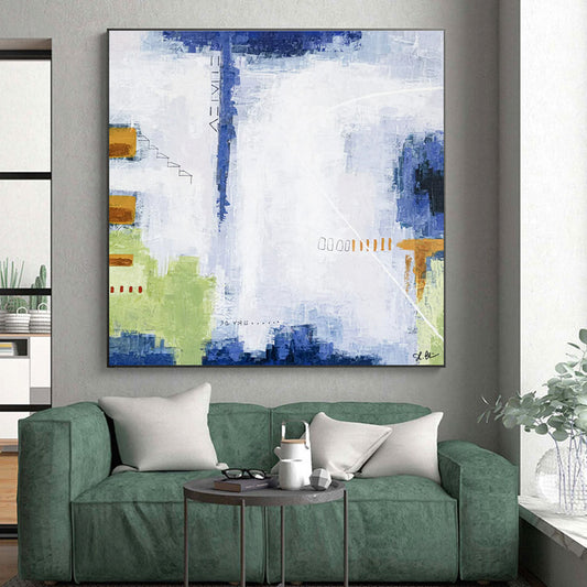
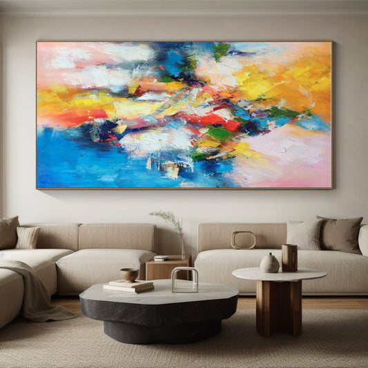
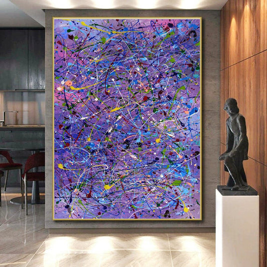
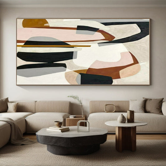
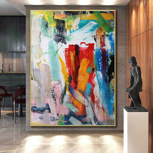
Warm colorful work leans on red, orange, yellow, coral, and gold. It raises the energy of a north-facing room and sits well with oak, walnut, and brass. Cool colorful work leans on teal, cobalt, violet, and emerald. It steadies a sun-baked wall and pairs with stone, chrome, and gray upholstery. Mixed palettes—blue plus gold, green plus blush—work when one family leads and the other accents.
Colour field painting, as Tate describes it, built entire canvases from large areas of relatively flat color. You do not need a Rothko to use the lesson: big, simple color shapes read at extra-large scale; a thousand tiny dabs can turn to noise from the sofa. If the listing photo looks exciting only when zoomed in, it may collapse on a ten-foot wall.
Kandinsky treated color as something that acts on the viewer directly. Tate records his line that color is a power that influences the soul. For a home, translate that without mysticism: saturated yellow advances; deep blue recedes; a hot pink next to a cool green will vibrate. Decide whether you want that vibration all day or only as a small accent inside a calmer field.
Measure the furniture, then decide how loud
Above a sofa or sideboard, keep the canvas at about two-thirds to three-quarters of the furniture width. Colorful work already carries visual weight. A too-wide, high-chroma panorama can flatten the seating. A too-narrow rainbow rectangle looks like a sample.
Hang 6 to 12 inches above the sofa back so the painting stays attached to the furniture. On an empty wall, put the center near standing eye level. Do not raise a bright canvas toward the ceiling “to fill the height.” Unused plaster above a strong color field is useful negative space.
Living rooms can take the strongest chroma if the textiles stay simple. Dining rooms need mid values so chandelier light does not turn the painting into a second centerpiece on top of the food. Bedrooms usually want fewer hues and lower gloss. Offices should avoid high-gloss color that flares on camera.
Harmony, contrast, and the rest of the room
A reliable method is to borrow one or two undertones from what you already own—sofa, wood, stone—and let the painting introduce the rest. If the sofa is oatmeal, a canvas of teal, rust, and cream will lock in. If the sofa is already patterned, choose larger color shapes and fewer hues.
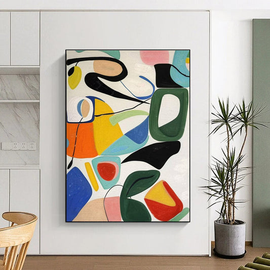
Complementary pairs (blue/orange, red/green, violet/yellow) create energy. Analogous runs (blue-teal-green, or yellow-orange-rust) feel more continuous. Color theory in the broad sense is simply this: relationships, not isolated swatches. A “colorful” painting that repeats the exact pillow color three times will look coordinated for a week and then go flat. Share a temperature; do not photocopy the throw.
Watch lighting. Warm bulbs push reds and golds forward and can muddy cool violets. Cool daylight keeps blues clean and can make yellow look sharp. If the only light is a harsh downlight, a satin or matte colorful field is safer than glossy acrylic peaks.
Surface: flat color versus built color
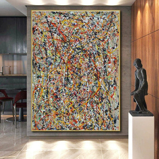
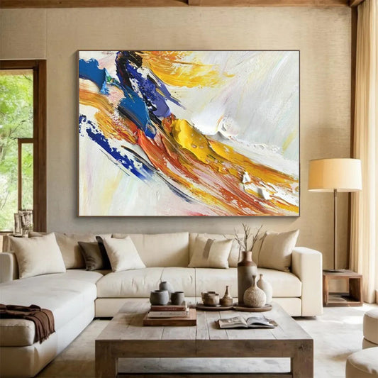
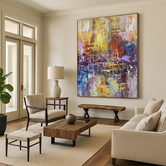
Canvashi’s colorful abstracts include splatter, impasto, and geometric blocks. Flat, stained color feels graphic and modern. Built, knifed color catches side light and keeps a high-key palette from looking like a poster. Ask for an angled photo. Printed “colorful art” and painted colorful artwork photograph similarly and live differently at large size.
Custom size is the practical advantage of a made-to-order canvas: match the sofa span instead of forcing a stock rectangle onto a long wall.
A short buying order
- Decide warm, cool, or one-family-plus-accent.
- Measure the sofa or clear wall; size to two-thirds–three-quarters width.
- Keep textiles quieter than the canvas, or keep the canvas simpler than the textiles.
- Prefer large color shapes at extra-large scale.
- Match sheen to the lamps.
Chosen that way, colorful artwork is a controlled climate for the room—not a pile of leftover tubes on the wall.
How many colors should a colorful painting have?
Enough for a clear temperature, not a full spectrum. Three to five related hues plus one accent usually hold a living room better than a dozen competing notes.
Will colorful artwork make a small room feel smaller?
Strong contrast and hot colors can advance toward you. In a compact room, use a cooler or mid-value field, or keep the loudest hues in a smaller share of the canvas.
Should colorful art match the sofa exactly?
No. Share an undertone with the furniture or wood, then let the painting add contrast. Exact matching often looks flat.
Is colorful abstract art suitable for a bedroom?
Yes, if chroma and gloss stay moderate. Soft layered color reads as atmosphere; neon splatter reads as daytime energy.
How large should colorful artwork be above a sofa?
About two-thirds to three-quarters of the sofa width. Because bright color already has weight, sizing up in chroma and sizing up in inches at the same time can overwhelm.
Does handmade colorful canvas look different from a print?
Yes at extra-large scale. Layered acrylic and knife marks shift with daylight. A print of the same palette stays locked to the photograph.