How to Choose Gray Abstract Wall Art That Has Value, Not Fog
Gray is not the absence of a decision. Bad gray is fog: one digital fill, no split, no temperature. Gray abstract wall art works when the field still has structure—ash against bone, charcoal against warm plaster, a cooler plane against a sand ground—and you can read that structure from the far side of the room. If the canvas only looks undecided, it is undecided.
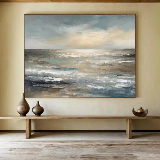
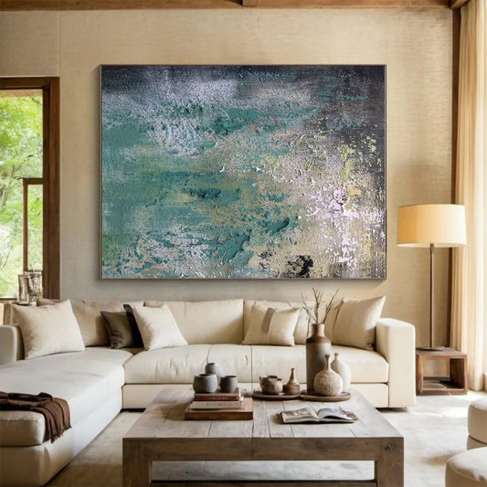
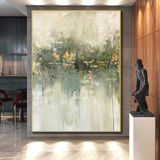
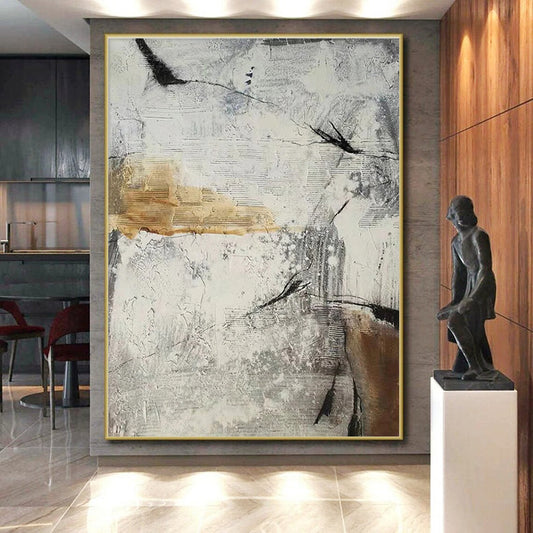
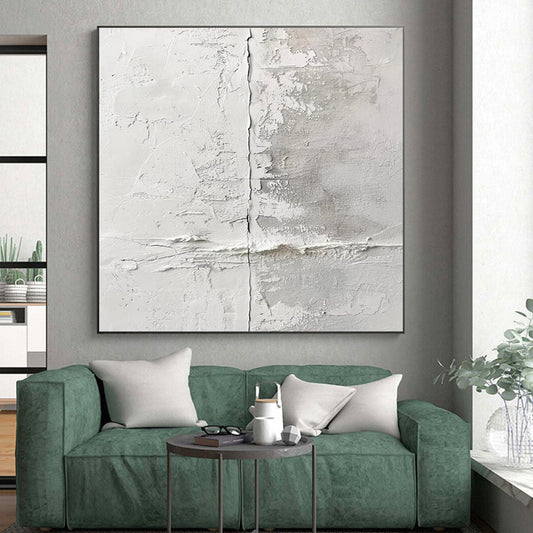
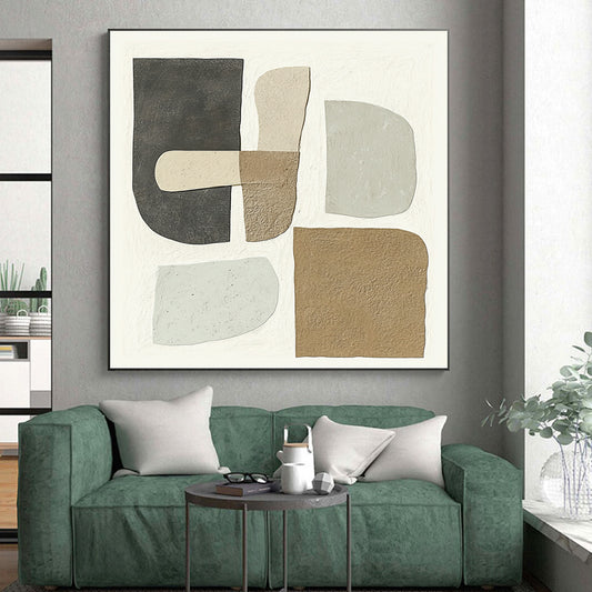
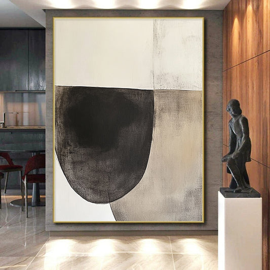
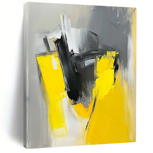
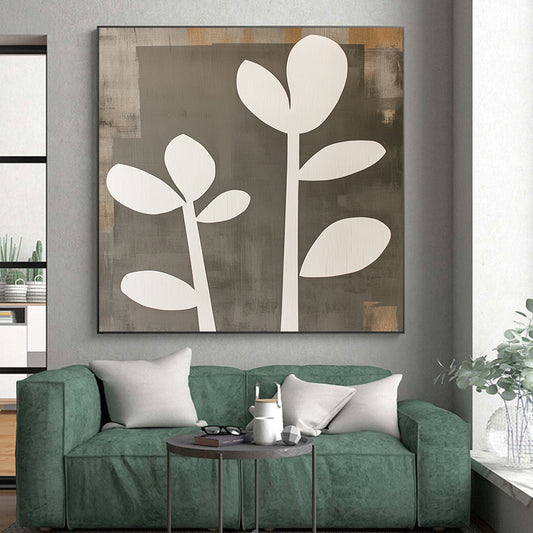
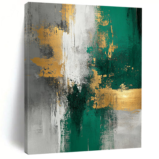
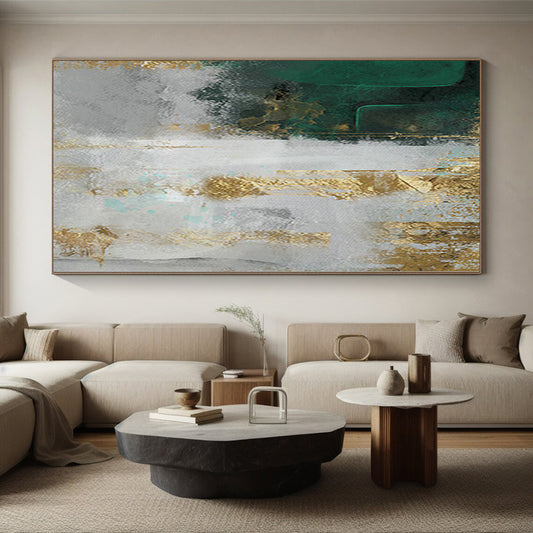
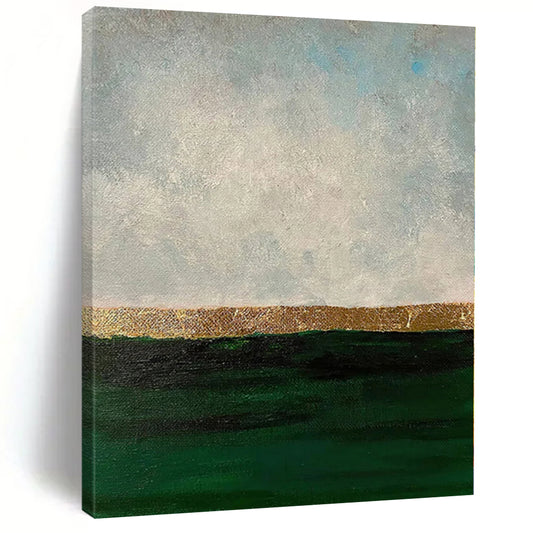
Gray Abstract Wall Art in this shop means hand-painted canvases in that range: gray-beige shores, teal-gray texture, green-gray land. The listing is a value climate. The piece you receive is painted to order in that climate, not a printed “neutral” panel.
Gray as a method, not as a missing color
Painters have a long word for work built from gray. Wikipedia’s article on grisaille describes painting in black, gray, and nearby neutrals, often to make form with tone instead of with hue. It was used as finished decoration and as underpainting. The shopping lesson is the same either way. Value does the work. If you flatten every gray to one swatch, form disappears.
Tate’s glossary on monochrome puts grisaille inside a larger habit: one color family, many tones. Light and dark define the object. In a living room that already has oak, linen, and a screen, that habit is useful. You do not need a second rainbow. You need a split you can name.
The National Gallery’s note on grisaille is blunt: monochrome or a very limited range, forms defined by tone. Mantegna could make gray pretend to be stone. You need less theatre. A contemporary gray canvas should pretend to be a wall that has thought about light—warm ash, cool slate, a broken white that is not optical brightener.
A working split:
- Warm gray: clay, greige, linen, a little umber. Sits with oak and walnut.
- Cool gray: ash, stone, blue-gray. Sits with marble, concrete, and steel.
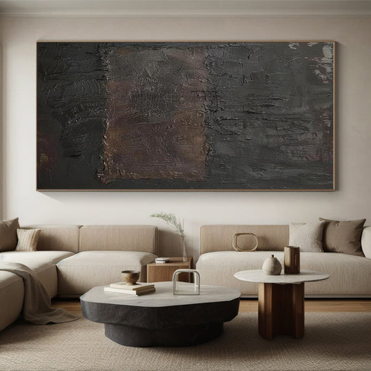
- Graphite and bone: higher contrast. Better on a pale, empty wall.
- One-note silver: the fog. Avoid it unless something else on the canvas—a ridge, a horizon—saves it.
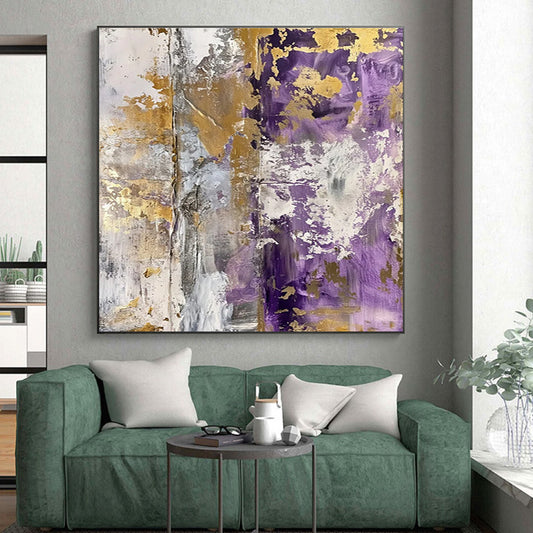
Gray with a second climate (beige sand, muted teal, olive) is still gray art if value leads. It is not a failure of purity. It is how most rooms actually work.
How to match gray to wood, stone, and lamps
Start with temperature, not with the word “neutral.” Oak fights icy silver and blue-white mist. It sits with greige, clay-gray, and a cream that has been dirtied on purpose. Gray sofas can take cooler ash, but they need a darker or warmer plane so the painting does not vanish into the upholstery. White rooms need mid-to-deep gray so noon light does not erase the field.
Then look at the hour you use the wall. North light cools gray toward steel. Warm bulbs pull ash toward taupe. A west window already throws gold; a cooler slate is often easier than another beige fog. If the listing was photographed in showroom white, check it against a daylight photo of your room.
Sheen matters. Glossy gray reads as appliance. Matte or satin gray reads as plaster and stone. Side light is what makes a thin ridge or a scumbled trough worth having. A spotlight on a pale gray field turns “quiet” into glare. Bedrooms and offices on camera need mid values and lower gloss.
Texture is a tool, not a requirement. A low built skin stops gray from reading as a printed panel. Heavy plaster on a timid composition is still timid. Ask whether deep relief ships rolled or stretched.
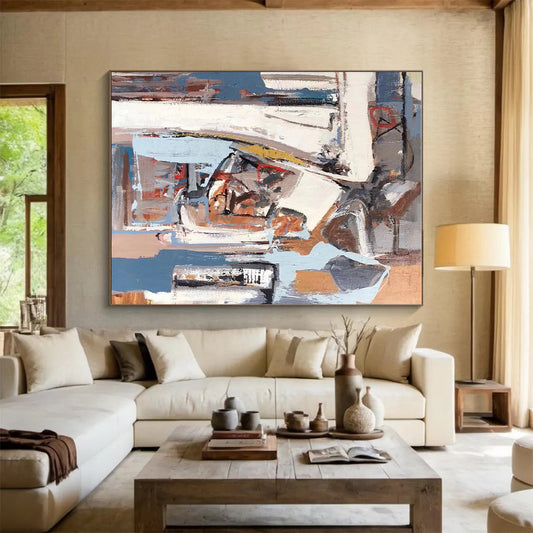
Format follows the empty rectangle. A long seating wall wants a horizontal field so the few value shifts read as architecture. Unused height can take a vertical slab. Square formats suit hallways you pass close. A small gray tile on a long wall looks like a sample chip.
Handmade gray versus a neutral print
Printed gray is one JPEG. Hand-painted gray breaks: a darker trough, a warmer scrap, an edge that was made rather than clipped. Look for angled close shots, oil or acrylic on canvas, and a note that the work is painted to order. Treat the thumbnail as temperature. Do not treat “gray” as a guarantee of calm.
Ask for more warmth if the floor is oak. Ask for less contrast if the room is already high-contrast black and white. Approve photos of the finished surface before it ships. Custom stretch exists for the span you measured.
A short buying order
- Name the gray: warm greige, cool ash, or graphite-and-bone.
- Match that temperature to wood, stone, and daylight.
- Measure the empty span; pick horizontal unless the unused space is height.
- Check sheen against lamps and any camera.
- Decide whether the field needs a low skin or should stay flat.
- Review photos of the finished canvas before it ships.
Gray abstract wall art that still works in a year is value on purpose. Fog is what you get when the only brief was “neutral.”
What is gray abstract wall art?
Abstract painting whose structure is built from gray and nearby neutrals—ash, bone, greige, graphite—rather than from a bright hue. A second muted climate can sit inside it. A single digital silver fill is not enough.
Will gray art look gloomy?
Not if the field has temperature and a split you can read. Gloom is a dark, glossy slab with no ground. Warm mid-gray with a lighter plane stays quiet without going funeral.
What grays sit with oak floors?
Greige, clay-gray, and linen-white. Icy blue-silver often fights the wood. Ask for a warmer ground if the listing runs cool.
Can gray abstract work in a bedroom or office?
Yes. Mid values and a matte or satin sheen are safer on camera than pale glossy silver. Keep contrast moderate if the room is already full of black frames.
How is hand-painted gray different from a print?
Handmade layers shift as you walk: troughs go darker, edges stay uneven. A print stays one fill. Confirm oil or acrylic, and ask for an angled close-up.
Can I order a warmer gray or a custom width?
Yes. Send the wall measurement and a daytime photo. Keep the same value structure as the listing, with more warmth or less contrast if the room needs it. Approve photos before shipping.