How to Choose Pink Wall Decor That Does Not Look Temporary
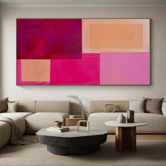
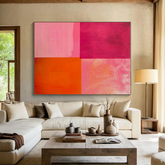
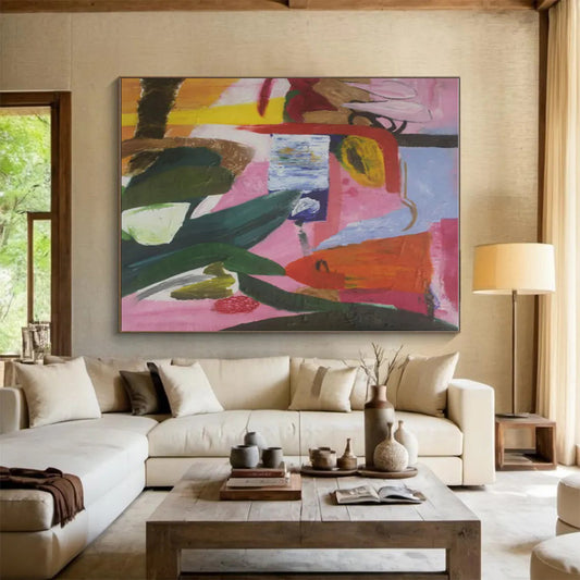
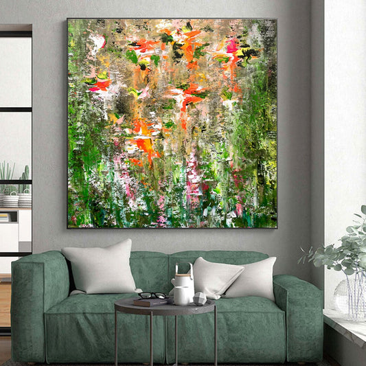
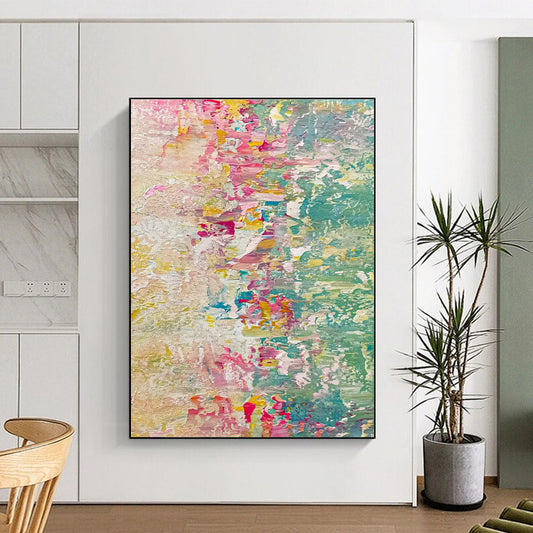
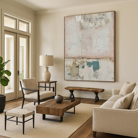
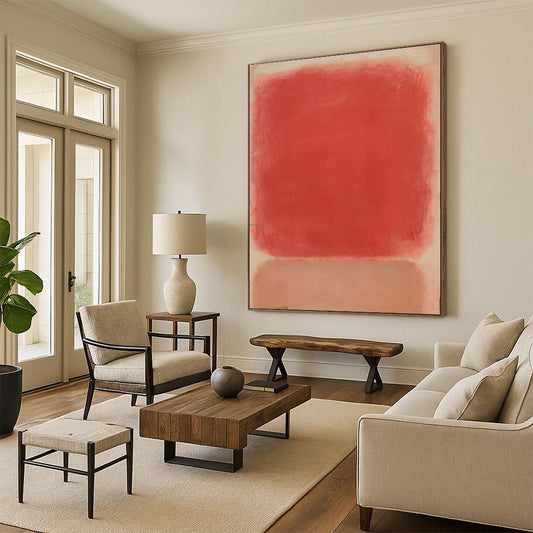
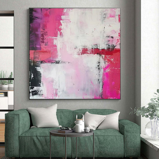
Pink is easy to buy and hard to live with. A blush canvas can calm a bedroom; a hot coral field can date a room in a season. Used with a clear undertone and a second color that already exists in the furniture, Pink Wall Decor on hand-painted abstract canvas is a practical way to add warmth without painting the walls. This guide is for oversized, textured, and geometric pink abstracts—including the floral-abstract pieces in the same family—not for small framed prints of roses.
What pink actually does on a wall
Pink is not a primary. It is red cut with white, or red leaning toward orange or violet, so two paintings titled “pink” can be dust, salmon, rose, or magenta. That mix is why pink shifts so hard under household light. Warm lamps push it toward peach. Cool LEDs push it toward chalk or lilac.
Modern painting treated pink as structure, not as a gender cue. Henri Matisse filled interiors with rose grounds so objects floated instead of sitting in brown shadow. Later, Helen Frankenthaler thinned paint so pink and coral soaked into raw canvas and behaved like weather rather than makeup. Abstract expressionism also used flesh-pink as a serious color: a field, a scrape, a temperature. The Met’s overview of the movement is a useful reminder that large color was meant to hold a room, not to accessorize it. See the museum’s essay on Abstract Expressionism.
The buying translation is blunt. If the pink is a wash with gray, blue, gold, or green holding it down, it will last. If the pink is a standalone candy field with no counter-color, it will look like a theme.
Read the pink before you read the size
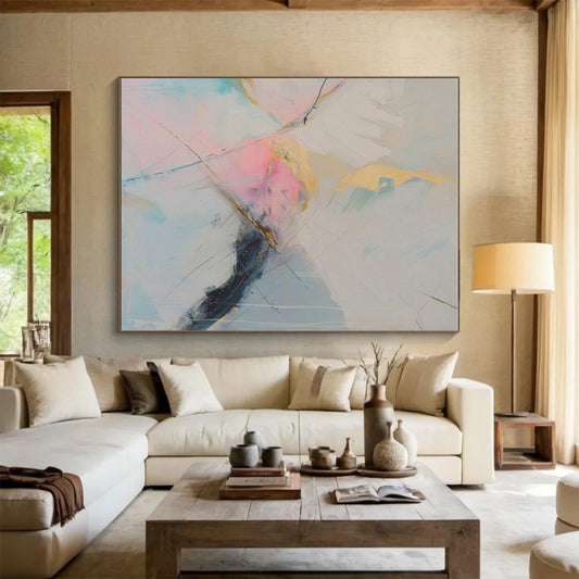
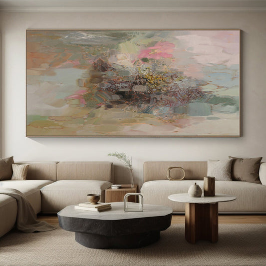
- Blush, dust, and rose are the most livable. They sit next to oak, linen, cream walls, and pale stone. They are the default for bedrooms.
- Salmon and peach lean warm and work with walnut, terracotta, and brass. They can clash with cool gray sofas.
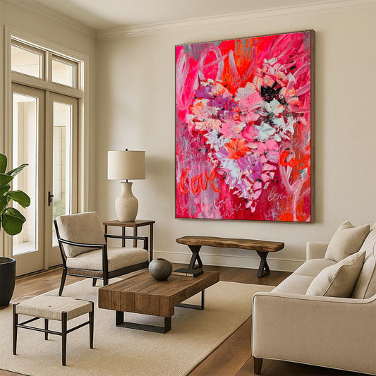
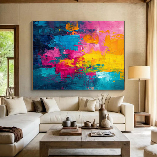
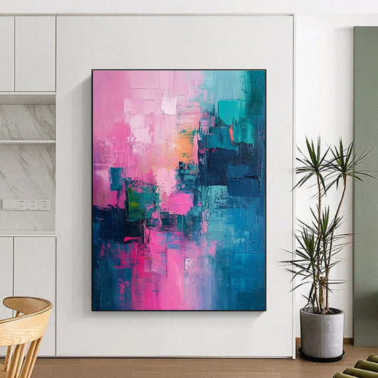
- Coral and hot pink are accents, not climates. They belong in geometric compositions with orange, red, or teal, usually on a dining wall or a wide hallway.
- Magenta and pink-violet behave like purple. Pair them with gray or gold, not with a second magenta object.
Ask whether pink is the atmosphere or only a mark. If it occupies more than about a third of the canvas, treat it as a wall-color decision. If it is a band, a floral-abstract shape, or a passage inside blue, green, or gold, the painting will move between rooms more easily.
Pink as a cultural color still carries nursery and marketing weight. Ignore that when you shop. Judge the undertone against the largest object in the room: the sofa, the headboard, the floor. A dusty rose canvas above a charcoal sofa looks adult. The same canvas above a white daybed with matching throw pillows looks staged.
Pairings that hold
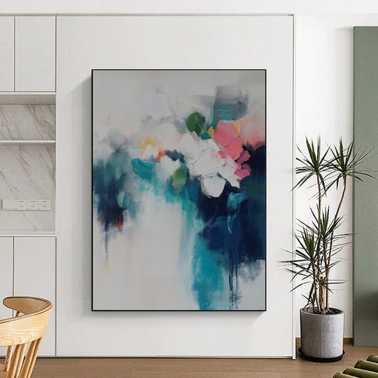
Blue, white, and pink is the cleanest contemporary set and suits coastal or cool rooms. Pink, gold, and blue or gray is the quieter luxury mix; gold should be a vein, not a frame piled on a pink field. Pink with green or teal is the most natural pairing—leaf against blossom—and it keeps floral-abstract canvases from turning sweet. Pink, orange, and red is high energy and wants a dining room or a studio. Pink, purple, and orange geometrics need space and a neutral wall; they are too loud for a bed you face all night.
Neutral walls help. Warm white, greige, soft taupe, and pale clay let pink register as temperature. A wall already painted pink rarely needs another pink canvas. If the room is already full of blush textiles, choose a painting where pink is bounded by green, blue, or charcoal.
Size, shape, and rooms
Above a sofa, bed, or console, aim for about 60–75 percent of the furniture width. A 90-inch sofa wants a canvas roughly 54–68 inches wide. Leave 6–8 inches between the furniture and the work. On an empty wall, keep the visual center near 57–60 inches from the floor.
Horizontal formats calm a bed wall and a long sofa. Geometric blocks suit offices and dining rooms. Soft textured fields and floral abstracts suit bedrooms if the pink stays dusty. Oversized single canvases serve high ceilings better than a cluster of small blush prints.
Pink earns an easy reputation in bedrooms and sitting rooms. It is weaker as the only color in a task-heavy office unless the pink is dusty and locked to gray or blue. In a small room, a pale pink field can open the wall; a dense coral field can close it. Leave paint around the canvas.
Surface, light, and a short checklist
Pink Wall Decor on hand-painted canvas earns its price in the surface. Texture paste, scraped grounds, and layered acrylic keep blush from looking like a poster. Confirm the listing is painted, not a print of a painting. Warm, dimmable light (about 2700–3000K) keeps rose from going chalk and coral from going neon. Gallery wrap with painted sides is the cleanest look. If you frame, use oak, white, or thin black—not a gold moulding that turns the whole wall into a vanity.
Dust with a dry cloth. Keep the work out of damp and out of hard, all-day sun; some red-based pinks can shift. Measure the furniture, match the undertone to the largest fabric in the room, and let one pink canvas be the warmest quiet object in the sightline.
What rooms work best for pink wall decor?
Bedrooms and sitting rooms take blush, dust, and rose well. Dining rooms can take coral and pink-orange geometrics. Nurseries can use pale pink, but the same canvas should still work when the room changes. Task-heavy offices usually need dusty pink locked to gray or blue, not a hot field.
Will pink wall decor look too feminine?
Only if the pink is unbounded and repeated in pillows, lamps, and flowers in the same view. A textured pink-and-green or pink-and-blue abstract above a dark sofa reads as color, not as a theme.
What colors pair with pink on a canvas?
Blue and white keep it cool. Green and teal keep floral abstracts from turning sweet. Gold and gray add quiet luxury. Orange and red raise the energy. Avoid stacking extra pink objects against a pink field.
What size pink canvas should I hang above a sofa or bed?
Use 60–75 percent of the furniture width and leave 6–8 inches above the back or headboard. One oversized canvas usually looks more finished than several small blush prints.
Is hand-painted pink canvas better than a print?
Yes if you will see the work up close. Layered paint and texture keep rose and coral from reading as a flat graphic. A print can work at a distance; it rarely holds evening light as well.